TUNG
Tung is punk: tattoos, spiky hair, tongues out – and now, staying sober. Bold, rebellious, and unapologetically real, Tung is a non-alcoholic beverage that lets you rage all night and still rise like a badass the next morning.
BRAND IDENTITY
PACKAGING
ILLUSTRATION
COPY

The brief and my solution.
Brief: Create a brand identity for a non-alcoholic beverage company with Swedish origins that stands out from the current market.
Solution: Create a brand identity that makes staying sober more fun – and cool – than drinking, brand inspired by Swedish Punk underground culture.
Brand Values: Deliberate, Rebellious, Truthful
BUILDING THE BRAND
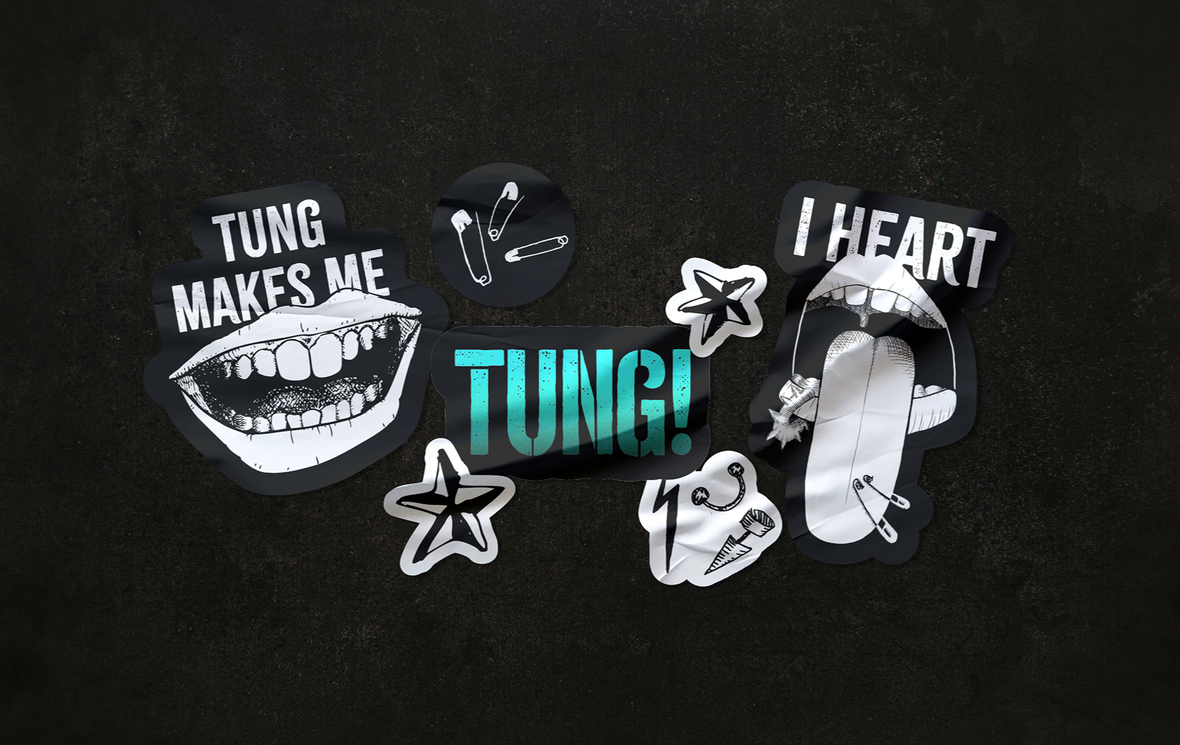
Off-beat illustrations take the main stage of the this project, embracing the edge, imperfection and individuality of punk culture.
In Sweden, the slang term “tung” is used to describe things that are cool, impressive, or “bad-ass” – the perfect name for a Swedish based company with a goal of being just that.
The logo has a stenciled, spray-painted effect, similar to the same aesthetic in underground, guerilla punk signage.

Illustrations of pierced tongues are not only a nod to the fact that “tung” sounds like the English word “tongue”, but they also embrace the unique punk aesthetic of tongue and lip piercings and modifications.
PACKAGING AND GRAPHIC ELEMENTS
TONE OF VOICE

Tung speaks to you like it means it. It’s loud and it walks the line of edgy and playful. Tung’s TOV always ties back to the brand values of staying deliberate, truthful, and rebellious.
The same rebellious and cheeky TOV is embraced in the online brand presence as well.

Colors and grainy, gradient graphic element is inspired by tagging and underground, guerilla signage. Font is bold and deliberate with texture, as if written or spray painted on a wall.
Each flavor has a different color and illustration.


