tung
Tung is punk: tattoos, spiky hair, tongues out – and now, staying sober. Bold, rebellious, and unapologetically real, Tung is a non-alcoholic beverage that lets you rage all night and still rise like a badass the next morning.
BRAND IDENTITY / PACKAGING / ILLUSTRATION / COPY
the brief and solution
Brief: Create a brand identity for a non-alcoholic beverage company with Swedish origins that stands out from the current market.
Solution: A brand identity inspired by Swedish Punk underground culture – embracing individuality, going against the grain, and having fun while doing it.

naming
After generous research on Swedish culture and slang, the Swedish slang word, “tung”, stood out. Not only punchy and easy enough to pronounce, but its definition fit the brand values seamlessly.
Tung officially means “heavy, grievous, hardcore”, but is Sweden is colloquially used in a “hell-yeah this f*ing rocks” way.
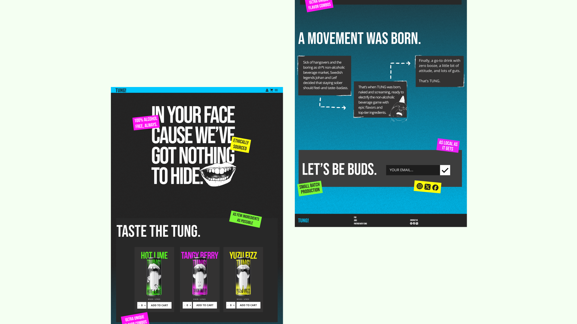
we’re pushing the sober agenda.
Making the decision not to drink is hard, and might feel a liiiittle bit uncool. Tung’s goal is to help you feel just as cool holding a sober drink at a party as you would holding an alcoholic one.
Plus, who needs liquid courage when your drink sparks conversation all night?

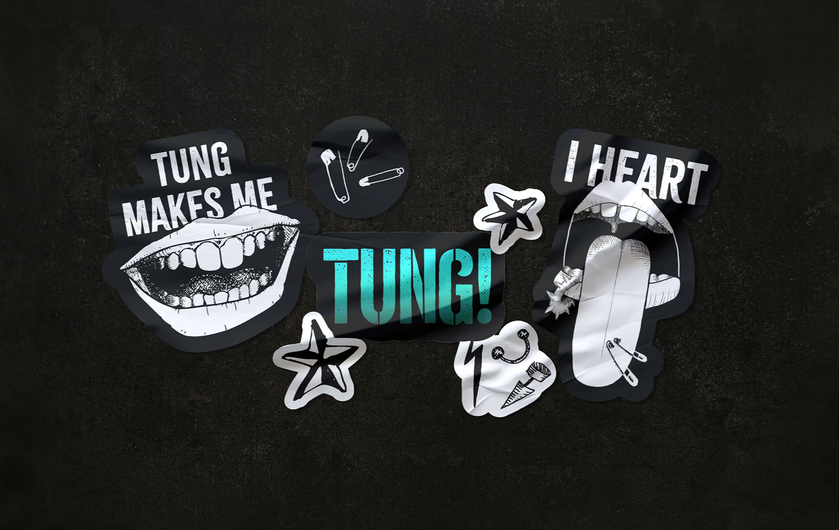
illustrations
The Swedish Punk scene is unpolished. It embraces individuality and self expression while maintaining a strong sense of community and identity through music, body modifications and fashion. Thus the tongues
The illustrations (left) on Tung’s cans are an ode to the classic “punk rock” tongue-out. The tongues embrace the sentiment of connection, despite any differences that you see between “us and you” in whatever context: punks vs normies to drinkers vs non-drinkers.
The moment the tongue illustration idea was conceived (above left) vs. the ones that didn’t cut it (above right) before landing on the final illustrations.

package art
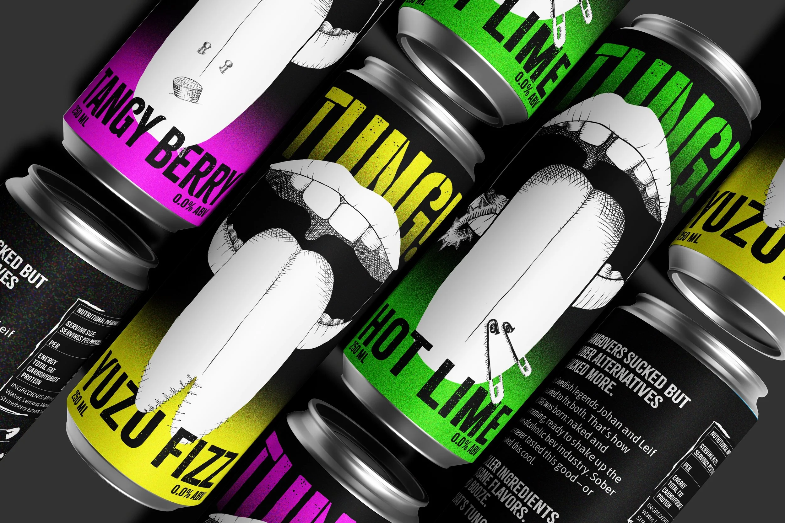
Each flavor has a different tongue illustration with different tongue modifications, tying in the concept of being different, together.
Tagging and guerrilla marketing has historically been a major part of punk culture, which is alluded to on the packaging with a grainy gradient, as if each can has been spray painted with classic cyberpunk colors: neon-ish pink, green, and yellow, and blue and purple as the brands and flavors expand.
The word mark also alludes to the stencils that are often used for tagging and guerrilla marketing.
digital design
ONE MOMENT THIS VIDEO WILL AUTOPLAY AND LOOP.


The marketing plays with the rebellious history of punk guerrilla signage culture by using punchy, quick messages of boycott. In this case: boycotting hangovers.
Individuality and humanness is maintained with the hand-drawn smile, and the punk-edge with the copy.
campaign rollout